输入组件
一个输入组件显示一个输入或一个下拉列表,一个单选按钮列表等。这些组件允许编辑记录属性,并且在<Edit>,<Create>和<Filter>视图中是常见的。
// in src/posts.js
import React from 'react';
import { Edit, DisabledInput, LongTextInput, ReferenceInput, SelectInput, SimpleForm, TextInput } from 'admin-on-rest';

export const PostEdit = (props) => (
    <Edit title={<PostTitle />} {...props}>
        <SimpleForm>
            <DisabledInput source="id" />
            <ReferenceInput label="User" source="userId" reference="users">
                <SelectInput optionText="name" />
            </ReferenceInput>
            <TextInput source="title" />
            <LongTextInput source="body" />
        </SimpleForm>
    </Edit>
);
所有输入组件都接受以下属性:
source:到view/edit的您的实体的属性名称。此属性是必需的。defaultValue:当属性为null或undefined时要设置的值。validate:当前属性的验证规则(请参阅Validation Documentation)label:用作输入标签的表头。省略时默认为source。style:用于定制字段容器的外观和风格的样式对象(例如表单中的<div>)。elStyle:一个样式对象,用于定制字段元素本身的外观。
其他一些属性逐步实现。<TextInput />和<NumberInput />输入也接受以下属性:
onBlur:当表单域失去焦点时调用的函数。它希望收到React SyntheticEvent和该字段的当前值的任意一个。onChange:在更改表单字段时调用的函数。它希望收到React SyntheticEvent和该字段的新值的任意一个。onFocus:当字段获取焦点时调用的函数。它以event作为参数。
<TextInput source="zb_title" label="Title" />
提示:如果编辑一条具有复杂结构的记录,则可以使用路径作为source参数。例如,如果API返回以下“book”记录:
{
    id: 1234,
    title: 'War and Peace',
    author: {
        firstName: 'Leo',
        lastName: 'Tolstoi'
    }
}
然后你可以显示一个文本输入来编辑作者名字,如下所示:
<TextInput source="author.firstName" />
提示:如果您的界面必须支持多种语言,请勿使用label,并将本地化标签放在字典中。有关详细信息,请参阅Translation documentation。
<AutocompleteInput>组件
要让用户使用自动填充的下拉列表选择列表中的值,请使用<AutocompleteInput>。 它使用Material ui的<AutoComplete>组件和fuzzySearch过滤器。设置choices属性来确定选项列表(使用id,name元组)。
import { AutocompleteInput } from 'admin-on-rest';
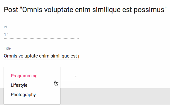
<AutocompleteInput source="category" choices={[
{ id: 'programming', name: 'Programming' },
{ id: 'lifestyle', name: 'Lifestyle' },
{ id: 'photography', name: 'Photography' },
]} />
您还可以自定义用于选项名称和值的属性,这要归功于optionText和optionValue属性:
const choices = [
    { _id: 123, full_name: 'Leo Tolstoi', sex: 'M' },
    { _id: 456, full_name: 'Jane Austen', sex: 'F' },
];
<AutocompleteInput source="author_id" choices={choices} optionText="full_name" optionValue="_id" />
optionText也接受一个函数,所以你可以随意设置选项文本:
const choices = [
   { id: 123, first_name: 'Leo', last_name: 'Tolstoi' },
   { id: 456, first_name: 'Jane', last_name: 'Austen' },
];
const optionRenderer = choice => `${choice.first_name} ${choice.last_name}`;
<AutocompleteInput source="author_id" choices={choices} optionText={optionRenderer} />
您可以自定义用于过滤结果的filter函数。默认情况下,它是AutoComplete.fuzzyFilter,但您可以使用通过AutoComplete提供的功能的任何一个或你自己的一个函数((searchText: string, key: string) => boolean):
import { AutocompleteInput } from 'admin-on-rest';
import AutoComplete from 'material-ui/AutoComplete';

<AutocompleteInput source="category" filter={AutoComplete.caseInsensitiveFilter} choices={choices} />
默认情况下会翻译选择项,因此您可以使用翻译标识符作为选择项:
const choices = [
   { id: 'M', name: 'myroot.gender.male' },
   { id: 'F', name: 'myroot.gender.female' },
];
然而,在某些情况下(例如在<ReferenceInput>内),您可能不希望翻译该选项。在这种情况下,请将translateChoice属性设置为false。
<AutocompleteInput source="gender" choices={choices} translateChoice={false}/>
最后,如果你想要覆盖Material UI的<AutoComplete>属性的任何一个,请使用options属性:
<AutocompleteInput source="category" options={{
    fullWidth: true,
    filter: AutoComplete.fuzzyFilter,
}} />
有关详细信息,请参阅Material UI Autocomplete documentation。
提示:如果要使用相关记录的列表填充choices属性,则应使用<ReferenceInput>装饰<AutocompleteInput>,并将choices留空:
import { AutocompleteInput, ReferenceInput } from 'admin-on-rest'

<ReferenceInput label="Post" source="post_id" reference="posts">
    <AutocompleteInput optionText="title" />
</ReferenceInput>
提示:<AutocompleteInput>是一个无状态组件,所以它只允许过滤选择列表,而不是扩展。 如果您需要根据fetch调用的结果填充选项列表(如果<ReferenceInput>不能满足您的需要),你得编写自己的输入组件基于material-ui <AutoComplete>组件。
提示:Admin-on-rest的<AutocompleteInput>只有一个大写字母A,而material-ui的<AutoComplete>有一个大写字母A和一个大写字母C。不要混淆组件!
<BooleanInput>与<NullableBooleanInput>组件
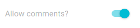
<BooleanInput />是一个切换按钮,允许您把true或false值归于一个记录字段。
import { BooleanInput } from 'admin-on-rest';

<BooleanInput label="Allow comments?" source="commentable" />
此输入不处理null值。如果您必须处理非设置的布尔值,则需要<NullableBooleanInput />组件。
您可以使用options属性传递被Material UIToggle组件支持的任何选项。
<BooleanInput source="finished" options={{
    labelPosition: 'right'
}} />
有关详细信息,请参阅Material UI Toggle documentation。
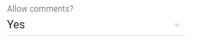
<NullableBooleanInput />渲染为下拉列表,允许在true,false和null值之间进行选择。
import { NullableBooleanInput } from 'admin-on-rest';

<NullableBooleanInput label="Allow comments?" source="commentable" />
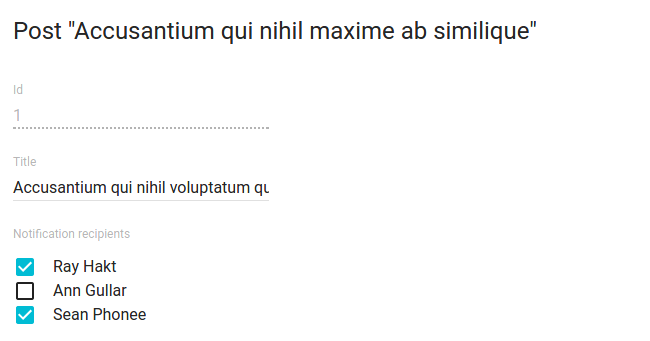
<CheckboxGroupInput>组件
如果要让用户通过显示所有值来选择可能值列表中的多个值,则<CheckboxGroupInput>是正确的组件。 设置choices属性来确定选项(使用id,name元组):
import { CheckboxGroupInput } from 'admin-on-rest';

<CheckboxGroupInput source="category" choices={[
    { id: 'programming', name: 'Programming' },
    { id: 'lifestyle', name: 'Lifestyle' },
    { id: 'photography', name: 'Photography' },
]} />
您还可以自定义用于选项名称和值的属性,这要归功于optionText和optionValue属性:
const choices = [
    { _id: 123, full_name: 'Leo Tolstoi', sex: 'M' },
    { _id: 456, full_name: 'Jane Austen', sex: 'F' },
];
<CheckboxGroupInput source="author_id" choices={choices} optionText="full_name" optionValue="_id" />
optionText也接受一个函数,所以你可以随意设置选项文本:
const choices = [
   { id: 123, first_name: 'Leo', last_name: 'Tolstoi' },
   { id: 456, first_name: 'Jane', last_name: 'Austen' },
];
const optionRenderer = choice => `${choice.first_name} ${choice.last_name}`;
<CheckboxGroupInput source="author_id" choices={choices} optionText={optionRenderer} />
optionText也接受一个React元素,它将被克隆,并接收相关联选项作为record属性。 您可以在那里使用Field组件。
const choices = [
   { id: 123, first_name: 'Leo', last_name: 'Tolstoi' },
   { id: 456, first_name: 'Jane', last_name: 'Austen' },
];
const FullNameField = ({ record }) => <span>{record.first_name} {record.last_name}</span>;
<CheckboxGroupInput source="gender" choices={choices} optionText={<FullNameField />}/>
默认情况下会翻译选择项,因此您可以使用翻译标识符作为选择项:
const choices = [
    { id: 'programming', name: 'myroot.category.programming' },
    { id: 'lifestyle', name: 'myroot.category.lifestyle' },
    { id: 'photography', name: 'myroot.category.photography' },
];
然而,在某些情况下(例如在<ReferenceInput>内),您可能不希望翻译该选择项。在这种情况下,请将translateChoice属性设置为false。
<CheckboxGroupInput source="gender" choices={choices} translateChoice={false}/>
最后,如果要覆盖任何Material UI的<Checkbox>属性,请使用options属性:
<CheckboxGroupInput source="category" options={{
    labelPosition: 'right'
}} />
有关详细信息,请参阅Material UI Checkbox documentation。
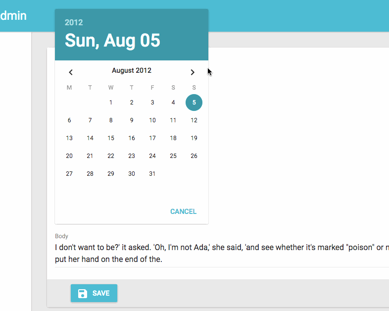
<DateInput>组件
理想的编辑日期,<DateInput>呈现一个美丽的具有完全本地化支持的Date Picker。
import { DateInput } from 'admin-on-rest';

<DateInput source="published_at" />
您可以通过设置options属性覆写Material UI的<DatePicker>的任何属性。
<DateInput source="published_at" options={{
    mode: 'landscape',
    minDate: new Date(),
    hintText: 'Choisissez une date',
    DateTimeFormat,
    okLabel: 'OK',
    cancelLabel: 'Annuler'
    locale: 'fr'
}} />
有关详细信息,请参阅Material UI Datepicker documentation。
<DisabledInput>组件
当您希望在一个<Edit>表单中显示一个记录属性时,不要让用户更新它(例如自动递增的主键),请使用<DisabledInput>:
import { DisabledInput } from 'admin-on-rest';

<DisabledInput source="id" />
提示:要将不可编辑的字段添加到<Edit>视图中,还可以使用admin-on-rest其中一个Field组件:
// in src/posts.js
import { Edit, LongTextInput, SimpleForm, TextField } from 'admin-on-rest';

export const PostEdit = (props) => (
    <Edit {...props}>
        <SimpleForm>
            <TextField source="title" /> {/* NOT EDITABLE */}
            <LongTextInput source="body" />
        </SimpleForm>
    </Edit>
);
提示:您甚至可以使用自己的组件,只要它接受record属性:
// in src/posts.js
import { Edit, LongTextInput, SimpleForm } from 'admin-on-rest';
const titleStyle = { textOverflow: 'ellipsis', overflow: 'hidden', maxWidth: '20em' };
const Title = ({ record }) => <span style={titleStyle}>{record.title}</span>;
Title.defaultProps = {
    addLabel: true,
};

export const PostEdit = (props) => (
    <Edit {...props}>
        <SimpleForm>
            <Title label="Title" />
            <LongTextInput source="body" />
        </SimpleForm>
    </Edit>
);
<ImageInput>组件
<ImageInput>允许使用react-dropzone上传一些图片。
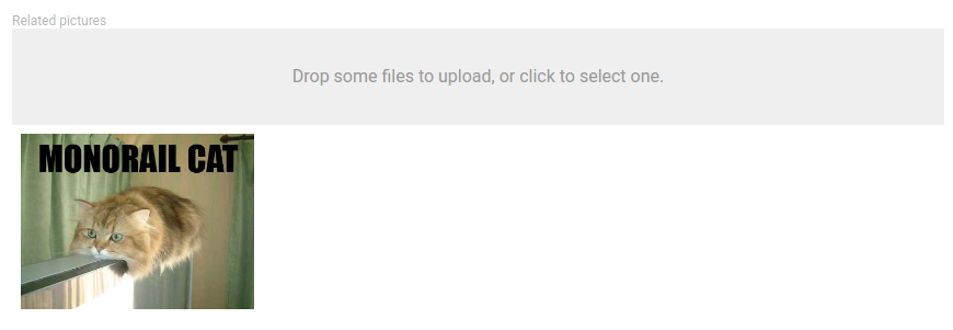
使用<ImageInput>子级启用预览,如下所示:
<ImageInput source="pictures" label="Related pictures" accept="image/*">
    <ImageField source="src" title="title" />
</ImageInput>
编写用于显示当前值的自定义字段组件很简单:它是标准的field。
当接收到新的文件时,ImageInput会将一个rawFile属性添加到作为子级record属性传递的对象中。 这个rawFile是新添加的文件File的实例。这可以用于显示关于自定义字段中的大小或mimetype的信息。
除了admin-on-rest那些之外,ImageInput组件还接受所有react-dropzone properties。例如,如果您需要一次上传几个图像,只需将multipleDropZone属性添加到您的<ImageInput />字段。
如果默认的Dropzone标签不符合您的需要,您可以传递一个placeholder属性来覆盖它。属性可以是任何React可以渲染的东西(PropTypes.node):
<ImageInput source="pictures" label="Related pictures" accept="image/*" placeholder={<p>Drop your file here</p>}>
    <ImageField source="src" title="title" />
</ImageInput>
请注意,图像上传返回一个File对象。您有责任根据您的API行为来处理它。您可以将其编码为base64,或将其作为多部分表单数据发送。通过扩展REST客户端,查看this example有关base64编码数据。
<FileInput>组件
<FileInput>允许使用react-dropzone上传一些文件。
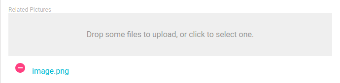
使用<FileInput>子级启用预览(实际上是一个简单的文件名称列表),如下所示:
<FileInput source="files" label="Related files" accept="application/pdf">
    <FileField source="src" title="title" />
</FileInput>
编写用于显示当前值的自定义字段组件很简单:它是标准的field。
当接收到新的文件时,FileInput将会将一个rawFile属性添加到作为子级record属性传递的对象中。 这个rawFile是新添加的文件的File实例。 这可以用于显示关于自定义字段中的大小或mimetype的信息。
除了admin-on-rest那些之外,FileInput组件还接受所有react-dropzone properties。例如,如果您需要一次上传多个文件,只需将multipleDropZone属性添加到您的<FileInput />字段。
如果默认的Dropzone标签不符合您的需要,您可以传递一个placeholder属性来覆盖它。属性可以是任何React可以渲染的东西(PropTypes.node):
<FileInput source="files" label="Related files" accept="application/pdf" placeholder={<p>Drop your file here</p>}>
    <ImageField source="src" title="title" />
</FileInput>
请注意,文件上传返回File对象。 您有责任根据您的API行为来处理它。您可以将其编码为base64,或将其作为多部分表单数据发送。通过扩展REST客户端,查看this example关于base64编码数据。
<LongTextInput>组件
<LongTextInput>是多行文本值的最佳选择。它呈现为一个自动展开的文本区域。
import { LongTextInput } from 'admin-on-rest';

<LongTextInput source="teaser" />
<NumberInput>组件
<NumberInput>转换为HTMl<input type="number">。由于[known React bug](https://github.com/facebook/react/issues/1425),因此数字值是必需的,在那种情况下这阻止了使用更通用的[`
import { NumberInput } from 'admin-on-rest';

<NumberInput source="nb_views" />
您可以自定义step属性(默认为“any”):
<NumberInput source="nb_views" step={1} />
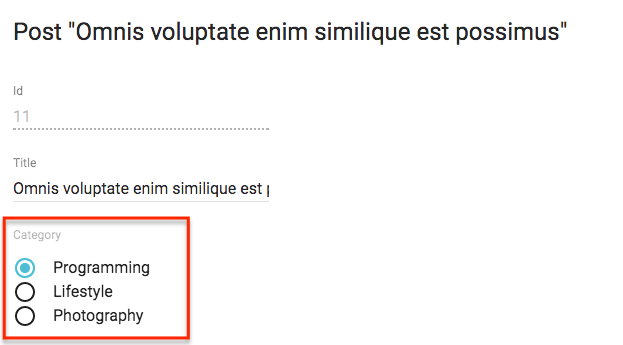
<RadioButtonGroupInput>组件
如果要让用户通过显示的所有值(而不是将它们隐藏在下拉列表之后)选择一个在可能值列表中的值,如<SelectInput>,<RadioButtonGroupInput> 是正确的组件。设置choices属性来确定选项(使用id,name元组):
import { RadioButtonGroupInput } from 'admin-on-rest';

<RadioButtonGroupInput source="category" choices={[
    { id: 'programming', name: 'Programming' },
    { id: 'lifestyle', name: 'Lifestyle' },
    { id: 'photography', name: 'Photography' },
]} />
您还可以自定义用于选项名称和值的属性,这要归功于optionText和optionValue属性:
const choices = [
    { _id: 123, full_name: 'Leo Tolstoi', sex: 'M' },
    { _id: 456, full_name: 'Jane Austen', sex: 'F' },
];
<RadioButtonGroupInput source="author_id" choices={choices} optionText="full_name" optionValue="_id" />
optionText也接受一个函数,所以你可以随意设置选项文本:
const choices = [
   { id: 123, first_name: 'Leo', last_name: 'Tolstoi' },
   { id: 456, first_name: 'Jane', last_name: 'Austen' },
];
const optionRenderer = choice => `${choice.first_name} ${choice.last_name}`;
<RadioButtonGroupInput source="author_id" choices={choices} optionText={optionRenderer} />
optionText也接受一个React元素,它将被克隆,并接收相关选择作为record属性。您可以在那里使用Field组件。
const choices = [
   { id: 123, first_name: 'Leo', last_name: 'Tolstoi' },
   { id: 456, first_name: 'Jane', last_name: 'Austen' },
];
const FullNameField = ({ record }) => <span>{record.first_name} {record.last_name}</span>;
<RadioButtonGroupInput source="gender" choices={choices} optionText={<FullNameField />}/>
选项被默认翻译,因此您可以使用翻译标识符作为选项:
const choices = [
   { id: 'M', name: 'myroot.gender.male' },
   { id: 'F', name: 'myroot.gender.female' },
];
然而,在某些情况下(例如在<ReferenceInput>内),您可能不希望翻译该选项。在这种情况下,请将translateChoice属性设置为false。
<RadioButtonGroupInput source="gender" choices={choices} translateChoice={false}/>
最后,如果要覆盖Material UI的<RadioButtonGroup>任何属性,请使用options属性:
<RadioButtonGroupInput source="category" options={{
    labelPosition: 'right'
}} />
有关详细信息,请参阅Material UI SelectField documentation。
提示:如果要使用相关记录列表填充choices属性,则应使用<ReferenceInput>装饰<RadioButtonGroupInput>,并将选项留空:
import { RadioButtonGroupInput, ReferenceInput } from 'admin-on-rest'

<ReferenceInput label="Author" source="author_id" reference="authors">
    <RadioButtonGroupInput optionText="last_name" />
</ReferenceInput>
<ReferenceInput>组件
对于外键值使用<ReferenceInput>,即让用户从另一个REST端点中选择一个值。该组件在引用资源中获取可能的值(使用GET_LISTREST方法),然后将渲染委托给一个子组件,它将可能的选择作为choices属性传递给该子组件。
这意味着您可以使用<ReferenceInput>具有<SelectInput>, <AutocompleteInput>或<RadioButtonGroupInput>任何一个,或者甚至使用您选择的组件,只要它支持choices属性。
该组件需要一个source和reference属性。 例如,要使comment的post_id可编辑:
import { ReferenceInput, SelectInput } from 'admin-on-rest'

<ReferenceInput label="Post" source="post_id" reference="posts">
    <SelectInput optionText="title" />
</ReferenceInput>
注意:你必须为引用资源添加一个<Resource> - admin-on-rest需要它来获取引用数据。如果您想在侧边栏菜单中隐藏它,你可以省略此引用中的list属性。
<Admin restClient={myRestClient}>
    <Resource name="comments" list={CommentList} />
    <Resource name="posts" />
</Admin>
当允许空值时,设置allowEmpty属性。
import { ReferenceInput, SelectInput } from 'admin-on-rest'

<ReferenceInput label="Post" source="post_id" reference="posts" allowEmpty>
    <SelectInput optionText="title" />
</ReferenceInput>
提示:对于<Filter>组件的所有Input组件子项,默认设置allowEmpty:
const CommentFilter = (props) => (
    <Filter {...props}>
        <ReferenceInput label="Post" source="post_id" reference="posts"> // no need for allowEmpty
            <SelectInput optionText="title" />
        </ReferenceInput>
    </Filter>
);
您可以调整此组件如何使用perPage,sort和filter属性获取可能的值。
// by default, fetches only the first 25 values. You can extend this limit
// by setting the `perPage` prop.
<ReferenceInput
     source="post_id"
     reference="posts"
     perPage={100}>
    <SelectInput optionText="title" />
</ReferenceInput>

// by default, orders the possible values by id desc. You can change this order
// by setting the `sort` prop (an object with `field` and `order` properties).
<ReferenceInput
     source="post_id"
     reference="posts"
     sort={{ field: 'title', order: 'ASC' }}>
    <SelectInput optionText="title" />
</ReferenceInput>

// you can filter the query used to populate the possible values. Use the
// `filter` prop for that.
<ReferenceInput
     source="post_id"
     reference="posts"
     filter={{ is_published: true }}>
    <SelectInput optionText="title" />
</ReferenceInput>
封闭的组件可以进一步过滤结果(例如,对于<AutocompleteInput>)。ReferenceInput将一个setFilter函数作为属性传递给它的子组件。它使用该值为查询创建一个过滤器 - 默认情况下为{ q: [searchText] }。 您可以自定义映射
searchText => searchQuery通过设置一个自定义的filterToQuery函数属性:
<ReferenceInput
     source="post_id"
     reference="posts"
     filterToQuery={searchText => ({ title: searchText })}>
    <SelectInput optionText="title" />
</ReferenceInput>
<ReferenceArrayInput>组件
使用<ReferenceArrayInput>编辑引用值数组,即让用户从另一个REST端点中选择值列表(通常是外键)。
在引用端点中,<ReferenceArrayInput>获取相关资源(使用CRUD_GET_MANYREST方法)与获取可能的资源(使用CRUD_GET_MATCHING REST方法)一样
例如,如果post对象有很多标签,则post资源可能如下所示:
{
    id: 1234,
    tag_ids: [1, 23, 4]
}
那么<ReferenceArrayInput>将从这两个调用中获取标签资源的列表:
http://myapi.com/tags?id=[1,23,4]
http://myapi.com/tags?page=1&perPage=25
一旦接收到重复数据删除的引用资源,该组件将渲染委托给一个子组件,它将可能的选择作为choices属性传递给该子组件。
这意味着您可以使用具有<SelectArrayInput>的<ReferenceArrayInput>,或者使用您选择的组件,只要它支持choices属性。
该组件需要一个source和reference属性。 例如,要使post的tag_ids可编辑:
import { ReferenceArrayInput, SelectArrayInput } from 'admin-on-rest'

<ReferenceArrayInput source="tag_ids" reference="tags">
    <SelectArrayInput optionText="name" />
</ReferenceArrayInput>
注意:你必须为引用资源添加一个<Resource> - admin-on-rest需要它来获取引用数据。 如果要在侧边栏菜单中隐藏它,可以在此引用中省略list属性。
<Admin restClient={myRestClient}>
    <Resource name="posts" list={PostList} edit={PostEdit} />
    <Resource name="tags" />
</Admin>
当允许空值时,设置allowEmpty属性。
import { ReferenceArrayInput, SelectArrayInput } from 'admin-on-rest'

<ReferenceArrayInput source="tag_ids" reference="tags" allowEmpty>
    <SelectArrayInput optionText="name" />
</ReferenceArrayInput>
提示:对于<Filter>组件的所有Input组件子项,默认设置allowEmpty:
您可以调整此组件如何使用perPage,sort和filter属性获取可能的值。
// by default, fetches only the first 25 values. You can extend this limit
// by setting the `perPage` prop.
<ReferenceArrayInput
     source="tag_ids"
     reference="tags"
     perPage={100}>
    <SelectArrayInput optionText="name" />
</ReferenceArrayInput>

// by default, orders the possible values by id desc. You can change this order
// by setting the `sort` prop (an object with `field` and `order` properties).
<ReferenceArrayInput
     source="tag_ids"
     reference="tags"
     sort={{ field: 'title', order: 'ASC' }}>
    <SelectArrayInput optionText="name" />
</ReferenceArrayInput>

// you can filter the query used to populate the possible values. Use the
// `filter` prop for that.
<ReferenceArrayInput
     source="tag_ids"
     reference="tags"
     filter={{ is_published: true }}>
    <SelectArrayInput optionText="name" />
</ReferenceArrayInput>
封闭的组件可以进一步过滤结果(例如,对于<SelectArrayInput>)。ReferenceArrayInput将一个setFilter函数作为属性传递给它的子组件。它使用该值为查询创建一个过滤器 - 默认情况下为{ q: [searchText] }。 您可以自定义映射
searchText => searchQuery通过设置一个自定义的filterToQuery函数属性:
<ReferenceArrayInput
     source="tag_ids"
     reference="tags"
     filterToQuery={searchText => ({ name: searchText })}>
    <SelectArrayInput optionText="name" />
</ReferenceArrayInput>
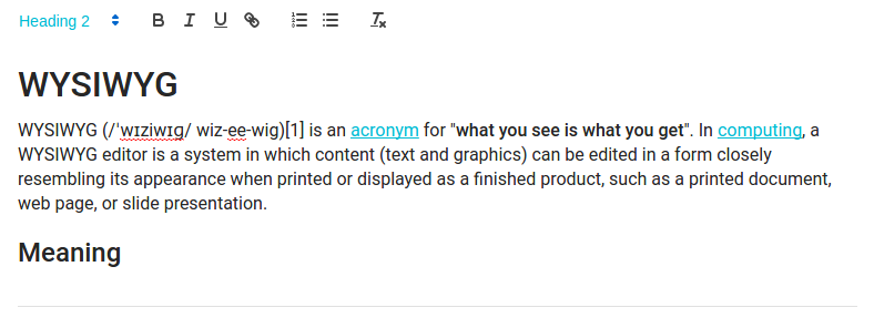
<RichTextInput>组件
如果要允许用户编辑一些HTML内容,则<RichTextInput>是理想的组件。 它
由Quill提供支持。
注意:由于其大小,<RichTextInput>在默认情况下不与admin-on-rest绑定。您必须首先使用npm进行安装:
npm install aor-rich-text-input --save
然后将其用作正常输入组件:
import RichTextInput from 'aor-rich-text-input';

<RichTextInput source="body" />
您可以使用toolbar属性自定义富文本编辑器工具栏,如Quill official toolbar documentation中所述。
<RichTextInput source="body" toolbar={[ ['bold', 'italic', 'underline', 'link'] ]} />
<SelectInput>组件
要让用户使用下拉列表选择列表中的值,请使用<SelectInput>。它使用Material ui的<SelectField>渲染。设置choices属性来确定选项(使用id,name tuples):
import { SelectInput } from 'admin-on-rest';

<SelectInput source="category" choices={[
    { id: 'programming', name: 'Programming' },
    { id: 'lifestyle', name: 'Lifestyle' },
    { id: 'photography', name: 'Photography' },
]} />
您还可以自定义用于选项名称和值的属性,这要归功于optionText和optionValue属性:
const choices = [
    { _id: 123, full_name: 'Leo Tolstoi', sex: 'M' },
    { _id: 456, full_name: 'Jane Austen', sex: 'F' },
];
<SelectInput source="author_id" choices={choices} optionText="full_name" optionValue="_id" />
optionText也接受一个函数,所以你可以随意设置选项文本:
const choices = [
   { id: 123, first_name: 'Leo', last_name: 'Tolstoi' },
   { id: 456, first_name: 'Jane', last_name: 'Austen' },
];
const optionRenderer = choice => `${choice.first_name} ${choice.last_name}`;
<SelectInput source="author_id" choices={choices} optionText={optionRenderer} />
optionText也接受一个React元素,它将被克隆,并接收相关选择作为record属性。您可以在那里使用Field组件。
const choices = [
   { id: 123, first_name: 'Leo', last_name: 'Tolstoi' },
   { id: 456, first_name: 'Jane', last_name: 'Austen' },
];
const FullNameField = ({ record }) => <span>{record.first_name} {record.last_name}</span>;
<SelectInput source="gender" choices={choices} optionText={<FullNameField />}/>
启用allowEmpty属性在选项之上添加一个空选项(带有null值),并使该值为空:
<SelectInput source="category" allowEmpty choices={[
    { id: 'programming', name: 'Programming' },
    { id: 'lifestyle', name: 'Lifestyle' },
    { id: 'photography', name: 'Photography' },
]} />
默认情况下会翻译选项,因此您可以使用翻译标识符作为选项:
const choices = [
   { id: 'M', name: 'myroot.gender.male' },
   { id: 'F', name: 'myroot.gender.female' },
];
但是,在某些情况下,您可能不希望翻译该选择项。在这种情况下,请将translateChoice属性设置为false。
<SelectInput source="gender" choices={choices} translateChoice={false}/>
请注意,当<SelectInput>是<ReferenceInput>的子级时,translateChoice是设置为false。
最后,如果要覆盖任何Material UI<SelectField>属性,请使用options属性:
<SelectInput source="category" options={{
    maxHeight: 200
}} />
有关详细信息,请参阅Material UI SelectField documentation。
提示:如果要使用相关记录的列表填充choices属性,则应使用<ReferenceInput>装饰<SelectInput>,并使choices留空:
import { SelectInput, ReferenceInput } from 'admin-on-rest'

<ReferenceInput label="Author" source="author_id" reference="authors">
    <SelectInput optionText="last_name" />
</ReferenceInput>
如果,而不是显示选择项作为下拉列表,您更喜欢将它们显示为单选按钮列表,请尝试<RadioButtonGroupInput>。如果列表太大,则更喜欢<AutocompleteInput>。
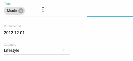
<SelectArrayInput>组件
要让用户使用下拉列表在列表中选择多个值,请使用<SelectArrayInput>。 它使用material-ui-chip-input渲染。 设置choices属性来确定选项(使用id,name tuples):
import { SelectArrayInput } from 'admin-on-rest';

<SelectArrayInput label="Tags" source="categories" choices={[
    { id: 'music', name: 'Music' },
    { id: 'photography', name: 'Photo' },
    { id: 'programming', name: 'Code' },
    { id: 'tech', name: 'Technology' },
    { id: 'sport', name: 'Sport' },
]} />
您还可以自定义要用于选项名称和值的属性,这归功于optionText和optionValue属性。
const choices = [
   { _id: '1', name: 'Book', plural_name: 'Books' },
   { _id: '2', name: 'Video', plural_name: 'Videos' },
   { _id: '3', name: 'Audio', plural_name: 'Audios' },
];
<SelectArrayInput source="categories" choices={choices} optionText="plural_name" optionValue="_id" />
optionText也接受一个函数,所以你可以随意设置选项文本:
const choices = [
   { id: '1', name: 'Book', quantity: 23 },
   { id: '2', name: 'Video', quantity: 56 },
   { id: '3', name: 'Audio', quantity: 12 },
];
const optionRenderer = choice => `${choice.name} (${choice.quantity})`;
<SelectArrayInput source="categories" choices={choices} optionText={optionRenderer} />
默认情况下会转换选项,因此您可以使用翻译标识符作为选择项:
const choices = [
   { id: 'books', name: 'myroot.category.books' },
   { id: 'sport', name: 'myroot.category.sport' },
];
但是,在某些情况下,您可能不希望翻译该选择项。在这种情况下,请将translateChoice属性设置为false。
<SelectArrayInput source="gender" choices={choices} translateChoice={false}/>
请注意,当<SelectArrayInput>是<ReferenceArrayInput>的子级时,translateChoice设置为false。
最后,如果要覆盖任何<ChipInput>属性,请使用options属性:
<SelectArrayInput source="category" options={{ fullWidth: true }} />
有关详细信息,请参阅the ChipInput documentation。
提示:如果要使用相关记录的列表填充choices属性,则应使用<ReferenceArrayInput>装饰<SelectArrayInput>,并留choices为空:
import { SelectArrayInput, ReferenceArrayInput } from 'admin-on-rest'

<ReferenceArrayInput source="tag_ids" reference="tags">
    <SelectArrayInput optionText="name" />
</ReferenceArrayInput>
<TextInput>组件
<TextInput>是最常见的输入。它用于文本,电子邮件,URL或密码。转换成HTML<input>标签。
import { TextInput } from 'admin-on-rest';

<TextInput source="title" />
您可以使用type属性选择特定的输入类型,例如text(默认),email,url或password:
<TextInput label="Email Address" source="email" type="email" />
警告:不要使用type="number",或者你会收到一个字符串作为值(这是一个known React bug)。 而是使用<NumberInput>。
转换输入值 到/从 Store
输入组件返回的数据格式可能不是您的store所需要的。由于Admin-on-rest使用Redux Form,我们可以使用它的parse()和format()函数来转换输入值到store或从store转换值。在你开始之前,最好理解input value's lifecycle。
这两个函数的助记:
parse(): input -> storeformat(): store -> input
说用户想要输入0-100的值到百分比字段,但是你的API(现在存储)期望为0-1.0。您可以使用简单的parse()和format()函数来转换归档:
<NumberInput source="percent" format={v => v*100} parse={v => v/100} label="Formatted number" />
<DateInput>存储并返回一个Date对象。如果您要在您的store中存储ISO日期"YYYY-MM-DD":
const dateFormatter = v => {
  // v is a string of "YYYY-MM-DD" format
  const match = /(\d{4})-(\d{2})-(\d{2})/.exec(v);
  if (match === null) return;
  const d = new Date(match[1], parseInt(match[2])-1, match[3]);
  if (isNaN(d)) return;
  return d;
};

const dateParser = v => {
  // v is a `Date` object
  if (!(v instanceof Date) || isNaN(v)) return;
  const pad = '00';
  const yy = v.getFullYear().toString();
  const mm = ((v.getMonth() + 1).toString();
  const dd = v.getDate().toString();
  return `${yy}-${(pad + mm).slice(-2)}-${(pad + dd).slice(-2)}`;
};

<DateInput source="isodate" format={dateFormatter} parse={dateParser} label="ISO date" />
第三方组件
您可以在第三方仓库中为admin-on-rest找到组件。
- dreinke/aor-color-input:一个使用React Color的颜色输入,一个颜色选择器的集合。
- LoicMahieu/aor-tinymce-input:TinyMCE组件,用于编辑HTML。
编写自己的输入组件
如果您需要更具体的输入类型,您还可以自己编写。您将不得不依靠redux-form的<Field>组件,以便处理值更新周期。
例如,我们编写一个组件来编辑当前记录的纬度和经度:
// in LatLongInput.js
import { Field } from 'redux-form';
const LatLngInput = () => (
<span>
<Field name="lat" component="input" type="number" placeholder="latitude" />
<Field name="lng" component="input" type="number" placeholder="longitude" />
</span>
);
export default LatLngInput;
// in ItemEdit.js
const ItemEdit = (props) => (
<Edit {...props}>
<SimpleForm>
<LatLngInput />
</SimpleForm>
</Edit>
);
LatLngInput不需要属性,因为<Field>组件可以通过它的上下文访问当前记录。name属性用作编辑记录属性的选择器。除name和component之外的所有Field属性都传递给子组件/元素(在该示例中为<input>)。执行此组件将大致渲染以下代码:
<span>
    <input type="number" placeholder="longitude" value={record.lat} />
    <input type="number" placeholder="longitude" value={record.lng} />
</span>
该组件缺少标签。 Admin-on-rest为它提供了<Labeled>组件:
// in LatLongInput.js
import { Field } from 'redux-form';
import { Labeled } from 'admin-on-rest';
const LatLngInput = () => (
<Labeled label="position">
<span>
<Field name="lat" component="input" type="number" placeholder="latitude" />
<Field name="lng" component="input" type="number" placeholder="longitude" />
</span>
</Labelled>
);
export default LatLngInput;
现在组件将使用标签进行渲染:
<label>Position</label>
<span>
    <input type="number" placeholder="longitude" value={record.lat} />
    <input type="number" placeholder="longitude" value={record.lng} />
</span>
将标签添加到输入组件是一个常见的操作,admin-on-rest可以自动做这件事:只需设置addLabel属性,然后在label属性中指定标签:
// in LatLongInput.js
import { Field } from 'redux-form';
const LatLngInput = () => (
<span>
<Field name="lat" component="input" type="number" placeholder="latitude" />
<Field name="lng" component="input" type="number" placeholder="longitude" />
</span>
);
export default LatLngInput;
// in ItemEdit.js
const ItemEdit = (props) => (
<Edit {...props}>
<SimpleForm>
<LatLngInput addLabel label="Position" />
</SimpleForm>
</Edit>
);
提示:为避免在每次使用组件时重复使用,您应该将label和addLabel定义为defaultProps:
// in LatLongInput.js
import { Field } from 'redux-form';
const LatLngInput = () => (
<span>
<Field name="lat" component="input" type="number" placeholder="latitude" />
<Field name="lng" component="input" type="number" placeholder="longitude" />
</span>
);
LatLngInput.defaultProps = {
addLabel: true,
label: 'Position',
}
export default LatLngInput;
// in ItemEdit.js
const ItemEdit = (props) => (
<Edit {...props}>
<SimpleForm>
<LatLngInput />
</SimpleForm>
</Edit>
);
提示:<Field>组件在name属性中支持点符号,来编辑嵌套属性:
const LatLongInput = () => (
<span>
<Field name="position.lat" component="input" type="number" placeholder="latitude" />
<Field name="position.lng" component="input" type="number" placeholder="longitude" />
</span>
);
而不是HTMLinput元素,您可以在<Field>中使用admin-on-rest组件。例如,<NumberInput>:
// in LatLongInput.js
import { Field } from 'redux-form';
import { NumberInput } from 'admin-on-rest';
const LatLngInput = () => (
<span>
<Field name="lat" component={NumberInput} label="latitude" />
<Field name="lng" component={NumberInput} label="longitude" />
</span>
);
export default LatLngInput;
// in ItemEdit.js
const ItemEdit = (props) => (
<Edit {...props}>
<SimpleForm>
<DisabledInput source="id" />
<LatLngInput />
</SimpleForm>
</Edit>
);
<NumberInput>接收传递给<Field>组件的属性 - 在示例中的label。<NumberInput>已经被标记了,所以没有必要也标注<LanLngInput>组件,这就是为什么这次addLabel没有被设置为默认的。
提示:如果您需要将material ui组件传递到Field,请使用field renderer function来映射属性:
import TextField from 'material-ui/TextField';
const renderTextField = ({ input, label, meta: { touched, error }, ...custom }) => (
<TextField
hintText={label}
floatingLabelText={label}
errorText={touched && error}
{...input}
{...custom}
/>
);
const LatLngInput = () => (
<span>
<Field name="lat" component={renderTextField} label="latitude" />
<Field name="lng" component={renderTextField} label="longitude" />
</span>
);
有关如何使用redux-form的<Field>组件的更多细节,请参阅the redux-form doc。
提示:如果在自定义输入中只需要一个<Field>组件,你可以让admin-on-rest为你做<Field>装饰,通过将addField默认属性设置为true:
// in PersonEdit.js
import SexInput from './SexInput.js';
const PersonEdit = (props) => (
    <Edit {...props}>
        <SimpleForm>
            <SexInput source="sex" />
        </SimpleForm>
    </Edit>
);

// in SexInput.js
import SelectField from 'material-ui/SelectField';
import MenuItem from 'material-ui/MenuItem';
const SexInput = ({ input, meta: { touched, error } }) => (
    <SelectField
        floatingLabelText="Sex"
        errorText={touched && error}
        {...input}
    >
        <MenuItem value="M" primaryText="Male" />
        <MenuItem value="F" primaryText="Female" />
    </SelectField>
);
SexInput.defaultProps = {
    addField: true, // require a <Field> decoration
}
export default SexInput;

// equivalent of

import SelectField from 'material-ui/SelectField';
import MenuItem from 'material-ui/MenuItem';
import { Field } from 'redux-form';
const renderSexInput = ({ input, meta: { touched, error } }) => (
    <SelectField
        floatingLabelText="Sex"
        errorText={touched && error}
        {...input}
    >
        <MenuItem value="M" primaryText="Male" />
        <MenuItem value="F" primaryText="Female" />
    </SelectField>
);
const SexInput = ({ source }) => <Field name={source} component={renderSexInput} />
export default SexInput;
大多数admin-on-rest输入组件在默认属性中使用addField: true。
提示:<Field>向其子组件注入两个属性:input和meta。要了解有关这些属性的更多信息,请在redux-form网站参阅the <Field> component documentation。