字段组件
一个Field组件显示一个REST resource一个给定的属性。此类组件备用于在List视图中,并且你也能用它们在Edit和Create视图中给只读字段。所有字段组件最常见的是<TextField>:
// in src/posts.js
import React from 'react';
import { List, Datagrid, TextField } from 'admin-on-rest';

export const PostList = (props) => (
    <List {...props}>
        <Datagrid>
            <TextField source="id" />
            <TextField source="title" />
            <TextField source="body" />
        </Datagrid>
    </List>
);
所有字段组件都接受以下属性:
source: 要查看/编辑的实体的属性名称。此属性是必需的。label: 用作输入标签的表头。 省略时默认为source。sortable: 应该使用source属性对列表进行排序吗? 默认为true。elStyle: 一个样式对象来自定义字段元素本身的界面外观。style:一个样式对象来自定义字段容器的界面外观(例如:datagrid中的<td>)。
<TextField source="zb_title" label="Title" style={{ color: 'purple' }} />
提示:如果你显示一条具有一个复杂结构的记录,你可以使用一个带有点分隔符的路径作为source属性。 例如,如果API返回以下'book'记录:
{
    id: 1234,
    title: 'War and Peace',
    author: {
        firstName: 'Leo',
        lastName: 'Tolstoi'
    }
}
然后可以显示作者名字如下:
<TextField source="author.firstName" />
提示:如果要根据该值格式化字段,请使用高阶组件执行条件格式设置,如Theming documentation中所述。
提示:如果你的界面必须支持多种语言,请勿使用label,放本地化标签放在字典中代替它。 有关详细信息,请参阅Translation documentation。
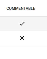
<BooleanField>组件
显示布尔值作为一个check。
import { BooleanField } from 'admin-on-rest';

<BooleanField source="commentable" />
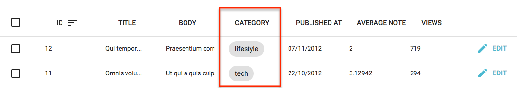
<ChipField>组件
在"Chip"内显示一个值,该值是标签的Material UI的术语。
import { ChipField } from 'admin-on-rest';

<ChipField source="category" />
该字段类型对于一对多关系尤其有用,例如:显示一个给定作者的书籍列表:
import { ChipField, SingleFieldList, ReferenceManyField } from 'admin-on-rest';

<ReferenceManyField reference="books" target="author_id">
    <SingleFieldList>
        <ChipField source="title" />
    </SingleFieldList>
</ReferenceManyField>
<DateField>组件
使用浏览器区域显示一个日期或日期时间(感谢Date.toLocaleDateString()和Date.toLocaleString())。
import { DateField } from 'admin-on-rest';

<DateField source="publication_date" />
此组件接受一个showTime属性(默认为false),以强制显示除日期之外的时间。它使用Intl.DateTimeFormat()如果可用,传递locales和options道具作为参数。如果Intl不可用,它将忽略locales和options属性。
<DateField source="publication_date" />
// renders the record { id: 1234, publication_date: new Date('2017-04-23') } as
<span>4/23/2017</span>

<DateField source="publication_date" showTime />
// renders the record { id: 1234, publication_date: new Date('2017-04-23 23:05') } as
<span>4/23/2017, 11:05:00 PM</span>

<DateField source="publication_date" options={{ weekday: 'long', year: 'numeric', month: 'long', day: 'numeric' }} />
// renders the record { id: 1234, publication_date: new Date('2017-04-23') } as
<span>Sunday, April 23, 2017</span>

<DateField source="publication_date" locales="fr-FR" />
// renders the record { id: 1234, publication_date: new Date('2017-04-23') } as
<span>23/04/2017</span>

<DateField source="publication_date" elStyle={{ color: 'red' }} />
// renders the record { id: 1234, publication_date: new Date('2017-04-23') } as
<span style="color:red;">4/23/2017</span>
有关options属性语法,请参阅Intl.DateTimeformat documentation。
提示:如果您需要比Intl.DateTimeformat可提供更多的格式化选项,利用一个第三方库如moment.js构建你自己的字段组件。
<EmailField>组件
<EmailField>将电子邮件显示为<a href="mailto:" />链接。
import { EmailField } from 'admin-on-rest';

<EmailField source="personal_email" />
<FunctionField>组件
如果你需要一个特殊的函数来渲染一个字段,那么<FunctionField>就是完美的匹配。它将record传递给通过开发人员提供的一个render函数。例如,要显示基于first_name和last_name属性的user记录的全名:
import { FunctionField } from 'admin-on-rest'

<FunctionField label="Name" render={record => `${record.first_name} ${record.last_name}`} />
提示:从技术上讲,由于您提供了渲染功能,因此您可以省略<FunctionField>的source属性。 但是,提供一个source将允许datagrid使列可排序,因为当用户单击列时,datagrid使用source属性作为排序字段。
<ImageField>组件
如果需要显示API提供的图像,你可以使用<ImageField />组件:
import { ImageField } from 'admin-on-rest';

<ImageField source="url" title="title" />
可选的title属性指向图片标题属性,用于alt和title属性。它可以是一个硬编写的字符串,也可以是在你JSON对象内的路径:
// { picture: { url: 'cover.jpg', title: 'Larry Cover (French pun intended)' } }

// Title would be "picture.title", hence "Larry Cover (French pun intended)"
<ImageField source="picture.url" title="picture.title" />

// Title would be "Picture", as "Picture" is not a path in previous given object
<ImageField source="picture.url" title="Picture" />
如果传递的值是在你JSON对象内的现有路径,那么它将使用object属性。否则,它将其值视为一个硬编写的标题。
如果该记录实际上包含一个由source属性定义在它属性中的图片数组,则需要src属性来确定图像的src值,例如:
// This is the record
{
    pictures: [
        { url: 'image1.jpg', desc: 'First image' },
        { url: 'image2.jpg', desc: 'Second image' },
    ],
}

<ImageField source="pictures" src="url" title="desc" />
<FileField>组件
如果需要显示API提供的文件,可以使用<FileField />组件:
import { FileField } from 'admin-on-rest';

<FileField source="url" title="title" />
可选的title参数指向文件标题属性,用于title属性。 它可以是一个硬编写的字符串,也可以是你JSON对象中的路径:
// { file: { url: 'doc.pdf', title: 'Presentation' } }

// Title would be "file.title", hence "Presentation"
<FileField source="file.url" title="file.title" />

// Title would be "File", as "File" is not a path in previous given object
<FileField source="file.url" title="File" />
如果传递的值是JSON对象中的现有路径,那么它将使用object属性。否则,它将其值视为一个硬编写的标题。
如果记录实际上包含由source属性定义在它属性中的一个文件数组,则需要src属性来确定链接的href值,例如:
// This is the record
{
    files: [
        { url: 'image1.jpg', desc: 'First image' },
        { url: 'image2.jpg', desc: 'Second image' },
    ],
}

<FileField source="files" src="url" title="desc" />
<NumberField>组件
显示根据浏览器区域设置格式化的数字,右对齐。
使用Intl.NumberFormat()如果可用,传递locales和options属性作为参数。 这允许完美显示小数,货币,百分比等。
如果Intl不可用,它会按原样输出数字(并忽略locales和options属性)。
import { NumberField }  from 'admin-on-rest';

<NumberField source="score" />
// renders the record { id: 1234, score: 567 } as
<span>567</span>

<NumberField source="score" options={{ maximumFractionDigits: 2 }}/>
// renders the record { id: 1234, score: 567.3567458569 } as
<span>567.35</span>

<NumberField source="share" options={{ style: 'percent' }} />
// renders the record { id: 1234, share: 0.2545 } as
<span>25%</span>

<NumberField source="price" options={{ style: 'currency', currency: 'USD' }} />
// renders the record { id: 1234, price: 25.99 } as
<span>$25.99</span>

<NumberField source="price" locales="fr-FR" options={{ style: 'currency', currency: 'USD' }} />
// renders the record { id: 1234, price: 25.99 } as
<span>25,99 $US</span>

<NumberField source="score" elStyle={{ color: 'red' }} />
// renders the record { id: 1234, score: 567 } as
<span style="color:red;">567</span>
有关options属性语法,请参阅Intl.Numberformat documentation。
提示:如果您需要比Intl.Numberformat可以提供更多的格式化选项,使用像numeral.js一个第三方库构建你自己的field组件。
<SelectField>组件
当您需要显示枚举字段时,<SelectField>将该值映射到一个字符串。
例如,如果gender字段可以取值“M”和“F”,下面是如何显示它作为"Male"或"Female":
import { SelectField } from 'admin-on-rest';

<SelectField source="gender" choices={[
   { id: 'M', name: 'Male' },
   { id: 'F', name: 'Female' },
]} />
默认情况下,文本构建通过
- 找到一个'id'属性等于字段值的选项
- 使用'name'属性一个选项文本
警告:如果您同时导入这两个,则此组件名称可能与material-ui的<SelectField>冲突。
您还可以自定义用于查找值和文本的属性,这要归功于'optionValue'和'optionText'属性。
const choices = [
   { _id: 123, full_name: 'Leo Tolstoi', sex: 'M' },
   { _id: 456, full_name: 'Jane Austen', sex: 'F' },
];
<SelectField source="author_id" choices={choices} optionText="full_name" optionValue="_id" />
optionText也接受一个函数,所以你可以随意设置选项文本:
const choices = [
   { id: 123, first_name: 'Leo', last_name: 'Tolstoi' },
   { id: 456, first_name: 'Jane', last_name: 'Austen' },
];
const optionRenderer = choice => `${choice.first_name} ${choice.last_name}`;
<SelectField source="author_id" choices={choices} optionText={optionRenderer} />
optionText也接受一个React元素,它将被克隆,并接收相关选择作为record属性。您可以在那里使用Field组件。
const choices = [
   { id: 123, first_name: 'Leo', last_name: 'Tolstoi' },
   { id: 456, first_name: 'Jane', last_name: 'Austen' },
];
const FullNameField = ({ record }) => <Chip>{record.first_name} {record.last_name}</Chip>;
<SelectField source="gender" choices={choices} optionText={<FullNameField />}/>
默认情况下翻译当前选项,因此您可以使用翻译标识符作为选择:
const choices = [
   { id: 'M', name: 'myroot.gender.male' },
   { id: 'F', name: 'myroot.gender.female' },
];
然而,在某些情况下(例如在<ReferenceField>内),您可能不希望翻译该选择。在这种情况下,请将translateChoice属性设置为false。
<SelectField source="gender" choices={choices} translateChoice={false}/>
提示:translateChoice设置为false。
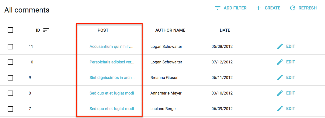
<ReferenceField>组件
该组件获取单个引用记录(使用GET_MANYREST方法),并显示此记录的一个字段。这就是为什么<ReferenceField>必须有一个子级<Field>。
例如,这里是如何获取与comment相关的post记录,并显示每个的title:
import React from 'react';
import { List, Datagrid, ReferenceField, TextField } from 'admin-on-rest';

export const CommentList = (props) => (
    <List {...props}>
        <Datagrid>
            <TextField source="id" />
            <ReferenceField label="Post" source="post_id" reference="posts">
                <TextField source="title" />
            </ReferenceField>
        </Datagrid>
    </List>
);
使用此配置,<ReferenceField>将评论标题包裹到相关帖子<Edit>页面的链接中。
<ReferenceField>接受一个reference属性,它指定为相关记录获取资源。 此外,您可以使用任何Field组件作为子级。
注意:你must为引用资源添加一个<Resource> - admin-on-rest需要它来获取引用数据。如果你想在侧边栏菜单中隐藏它,你可以省略此引用中的list属性。
<Admin restClient={myRestClient}>
    <Resource name="comments" list={CommentList} />
    <Resource name="posts" />
</Admin>
要更改链接从<Edit>页面为<Show>页面,设置linkType的属性为“show”。
<ReferenceField label="User" source="userId" reference="users" linkType="show">
    <TextField source="name" />
</ReferenceField>
你也可以通过将linkType设置为false来阻止<ReferenceField>添加链接到子级。
// No link
<ReferenceField label="User" source="userId" reference="users" linkType={false}>
    <TextField source="name" />
</ReferenceField>
如果您在<Edit>或<Show>页面中使用该字段,则可能需要显示与正在显示的字段相关联的标签。 在这种情况下,只需添加addLabel属性到<ReferenceField>来让source属性显示在字段顶部,或者可选的label属性,如果你想个性化它。
// Display 'User' Label on top of the TexField
<ReferenceField addLabel label="User" source="userId" reference="users">
    <TextField source="name" />
</ReferenceField>
提示:Admin-on-rest使用CRUD_GET_ONE_REFERENCE动作来累积并删除重复数据引用记录的id,以便为整个列表进行一个GET_MANY 调用,而不是GET_ONE调用。例如, 如果这个API返回下面的评论列表:
[
    {
        id: 123,
        body: 'Totally agree',
        post_id: 789,
    },
    {
        id: 124,
        title: 'You are right my friend',
        post_id: 789
    },
    {
        id: 125,
        title: 'Not sure about this one',
        post_id: 735
    }
]
然后admin-on-rest使用<ReferenceField>加载器呈现<CommentList>,在一次调用(GET http://path.to.my.api/posts?ids=[789,735])中获取相关帖子的API,并在数据到达后重新呈现列表。 这加速了渲染,并最大限度地减少了网络负载。
<ReferenceManyField>组件
该组件通过在其他资源(使用GET_MANY_REFERENCEREST方法)中反向查找当前的record.id来获取引用的记录列表。 另一资源中当前记录的id的字段名由所需的target字段指定。 然后将结果传递给迭代器组件(如<SingleFieldList>或<Datagrid>)。 迭代器组件通常具有一个或更多子<Field>组件。
例如,这里是如何通过将comment.post_id匹配到post.id来获取与post记录相关的comments,然后在<ChipField>中显示author.name:
import React from 'react';
import { List, Datagrid, ChipField, ReferenceManyField, SingleFieldList, TextField } from 'admin-on-rest';

export const PostList = (props) => (
    <List {...props}>
        <Datagrid>
            <TextField source="id" />
            <TextField source="title" type="email" />
            <ReferenceManyField label="Comments by" reference="comments" target="post_id">
                <SingleFieldList>
                    <ChipField source="author.name" />
                </SingleFieldList>
            </ReferenceManyField>
            <EditButton />
        </Datagrid>
    </List>
);
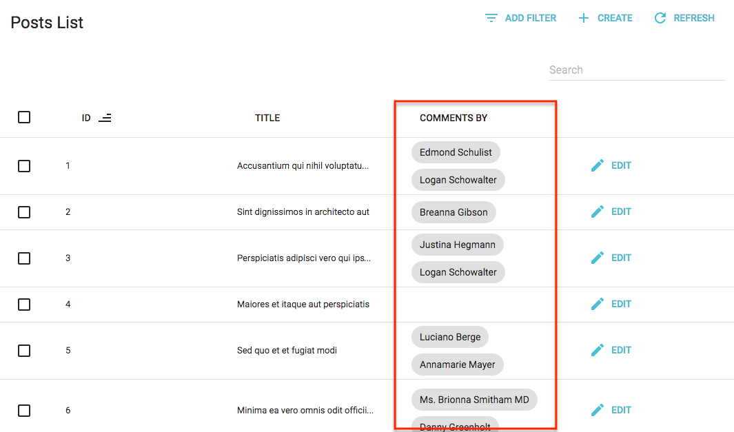
<ReferenceManyField>接受一个reference属性,它指定获取相关记录的资源。
注意:你必须为引用资源添加一个<Resource> - admin-on-rest需要它来获取引用数据。 如果您想将其隐藏在侧边栏菜单中,你可以省略此引用中的list属性。
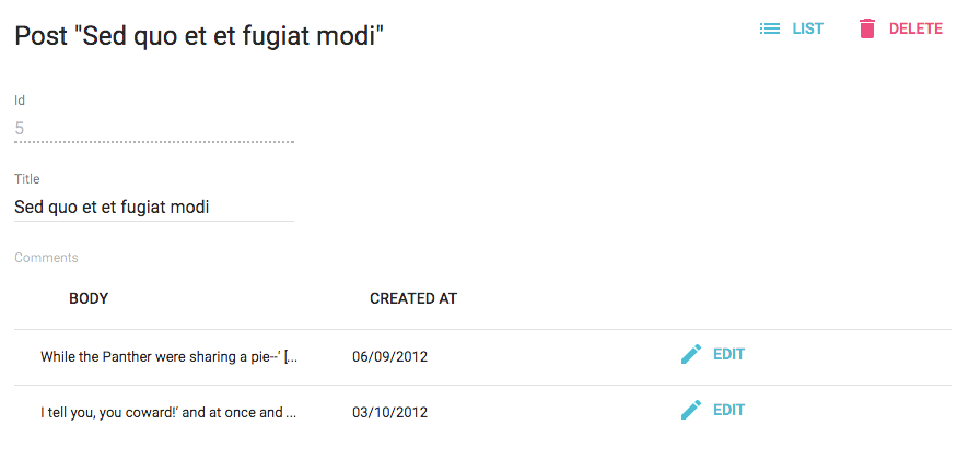
您可以使用<Datagrid>而不是<SingleFieldList>- 但不能在另一个<Datagrid>内! 如果要显示相关记录的只读列表,这很有用。 例如,如果要在帖子的<Edit>视图中显示与post相关的comments:
import React from 'react';
import { Edit, Datagrid, SimpleForm, DisabledInput, DateField, EditButton, ReferenceManyField, TextField, TextInput } from 'admin-on-rest';

export const PostEdit = (props) => (
    <Edit {...props}>
        <SimpleForm>
            <DisabledInput label="Id" source="id" />
            <TextInput source="title" />
            <ReferenceManyField label="Comments" reference="comments" target="post_id">
                <Datagrid>
                    <TextField source="body" />
                    <DateField source="created_at" />
                    <EditButton />
                </Datagrid>
            </ReferenceManyField>
        </SimpleForm>
    </Edit>
);
默认情况下,admin-on-rest将可能的值限制为25。您可以通过设置perPage属性来更改此限制。
<ReferenceManyField perPage={10} reference="comments" target="post_id">
   ...
</ReferenceManyField>
默认情况下,它通过id desc排序可能的值。 您可以通过设置sort 属性(具有field和order属性的对象)来更改此顺序。
<ReferenceManyField sort={{ field: 'created_at', order: 'DESC' }} reference="comments" target="post_id">
   ...
</ReferenceManyField>
此外,您还可以过滤用于填充可能值的查询。使用filter属性。
<ReferenceManyField filter={{ is_published: true }} reference="comments" target="post_id">
   ...
</ReferenceManyField>
<ReferenceArrayField>组件
使用<ReferenceArrayField>来显示基于外键数组的引用值列表。
例如,如果一个帖子有很多标签,一个帖子资源可能如下所示:
{
    id: 1234,
    title: 'Lorem Ipsum',
    tag_ids: [1, 23, 4]
}
[1, 23, 4]指的是tag资源的id。
<ReferenceArrayField>可以通过将post.tag_ids匹配到tag.id来获取与这个post资源相关的tag资源。 <ReferenceArrayField source="tags_ids" reference="tags">将发出一个HTTP请求,如下所示:
http://myapi.com/tags?id=[1,23,4]
提示:<ReferenceArrayField>使用GET_MANY REST方法获取相关资源,所以实际的HTTP请求取决于你的REST客户端。
一旦接收到相关的资源,<ReferenceArrayField>使用ids和data属性传递它们给它的子组件,所以孩子必须是一个迭代器组件(如<SingleFieldList>或<Datagrid>)。迭代器组件通常具有一个或多个子<Field>组件。
以下是如何获取PostList中每个帖子的标签列表,并在<ChipField>中显示每个tag的name:
import React from 'react';
import { List, Datagrid, ChipField, ReferenceArrayField, SingleFieldList, TextField } from 'admin-on-rest';

export const PostList = (props) => (
    <List {...props}>
        <Datagrid>
            <TextField source="id" />
            <TextField source="title" />
            <ReferenceArrayField label="Tags" reference="tags" source="tag_ids">
                <SingleFieldList>
                    <ChipField source="name" />
                </SingleFieldList>
            </ReferenceArrayField>
            <EditButton />
        </Datagrid>
    </List>
);
注意:您必须为引用资源添加一个<Resource>组件到您的<Admin>组件,因为admin-on-rest需要它来获取引用数据。 如果您不想在侧边栏菜单中显示一个条目给它你可以在此资源中省略list属性。
export const App = () => (
    <Admin restClient={simpleRestClient('http://path.to.my.api')}>
        <Resource name="posts" list={PostList} />
        <Resource name="tags" /> // <= this one is compulsory
    </Admin>
);
在“显示编辑”视图中,您可以将<ReferenceArrayField>与<Datagrid>组合在表中显示相关资源。 例如,要在PostShow视图中显示有关与帖子相关的标签的更多详细信息:
import React from 'react';
import { Show, SimpleShowLayout, TextField, ReferenceArrayField, Datagrid, ShowButton } from 'admin-on-rest';

export const PostShow = (props) => (
    <Show {...props}>
        <SimpleShowLayout>
            <TextField source="id" />
            <TextField source="title" />
            <ReferenceArrayField label="Tags" reference="tags" source="tag_ids">
                <Datagrid>
                    <TextField source="id" />
                    <TextField source="name" />
                    <ShowButton />
                </Datagrid>
            </ReferenceArrayField>
            <EditButton />
        </SimpleShowLayout>
    </Show>
);
<RichTextField>组件
此组件显示一些HTML内容。 内容默认为“丰富”(即未转义)。
import { RichTextField } from 'admin-on-rest';

<RichTextField source="body" />
stripTags属性(默认false)允许你删除任何HTML标记,防止一些显示毛刺(这在列表视图中特别有用)。
import { RichTextField } from 'admin-on-rest';

<RichTextField source="body" stripTags />
<TextField>组件
最简单的作为所有字段,<TextField>只是将记录属性显示为纯文本。
import { TextField } from 'admin-on-rest';

<TextField label="Author Name" source="name" />
<UrlField>组件
<UrlField>在< a href="">标签中显示一个url。
import { UrlField } from 'admin-on-rest';

<UrlField source="site_url" />
样式化字段
所有的字段组件都接受style属性,它覆盖字段容器的默认样式:
<TextField source="price" style={{ color: 'purple' }}/>
// renders in the datagrid as
<td style="color: purple;"><span>2</span></td>
如果你想要覆盖字段元素的样式,使用elStyle属性代替:
<TextField source="price" elStyle={{ color: 'purple' }}/>
// renders in the datagrid as
<td><span style="color: purple;">2</span></td>
admin-on-rest通常将字段组件的呈现委托给material ui组件。 请参阅material ui文档以查看元素的默认样式。
最后,您可能需要覆盖字段头部(datagrid中的<th>元素)。在这种情况下,使用headerStyle属性:
export const ProductList = (props) => (
    <List {...props}>
        <Datagrid>
            <TextField source="sku" />
            <TextField source="price"
                style={{ textAlign: 'right'}}
                headerStyle={{ textAlign: 'right' }}
            />
            <EditButton />
        </Datagrid>
    </List>
);
// renders in the datagrid as
<td style="text-align:right"><span>2</span></td>
// renders in the table header as
<th style="text-align:right;font-weight:bold"><button>Price</button></td>
编写你自己的字段组件
如果你在上面的列表中找不到您需要的内容,编写你自己的字段组件非常容易。它必须是一个常规的React组件,不仅可以接受source属性,还可以接受record属性。 Admin-on-rest将在渲染时基于API响应数据注入record。 字段组件只需要在record中找到source并显示它。
例如,这里等同于admin-on-rest的<TextField>组件:
import React from 'react';
import PropTypes from 'prop-types';

const TextField = ({ source, record = {} }) => <span>{record[source]}</span>;

TextField.propTypes = {
    label: PropTypes.string,
    record: PropTypes.object,
    source: PropTypes.string.isRequired,
};

export default TextField;
提示:render()方法中没有使用label属性,但是admin-on-rest使用它来显示表头。
提示:如果想要支持深域资源(例如author.name等源代码),请使用lodash.get替换简单的对象查找:
import get from 'lodash.get';
const TextField = ({ source, record = {} }) => <span>{get(record, source)}</span>;
如果您不是在寻找可重用性,您可以创建更简单的组件,没有任何属性。 假设一个API返回具有firstName和lastName属性的用户记录,并且要在用户列表中显示全名。
{
    id: 123,
    firstName: 'John',
    lastName: 'Doe'
}
和写作一样简单:
import React from 'react';
import { List, Datagrid, TextField } from 'admin-on-rest';

const FullNameField = ({ record = {} }) => <span>{record.firstName} {record.lastName}</span>;
FullNameField.defaultProps = { label: 'Name' };

export const UserList = (props) => (
    <List {...props}>
        <Datagrid>
            <FullNameField source="lastName" />
        </Datagrid>
    </List>
);
提示:在这样的自定义字段中,source是可选的。 Admin-on-rest用它来确定在列标题被单击时它的列用于排序。